Responsive websites optimised for mobile devices

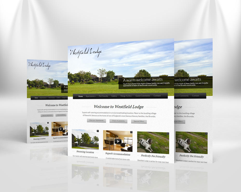
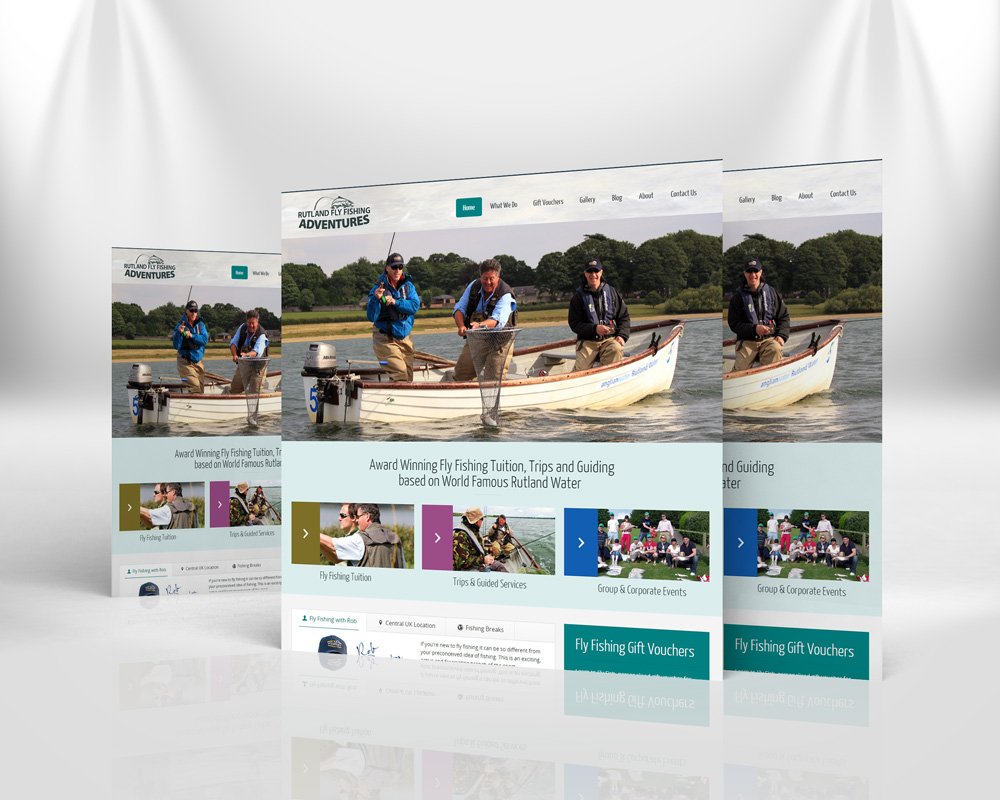
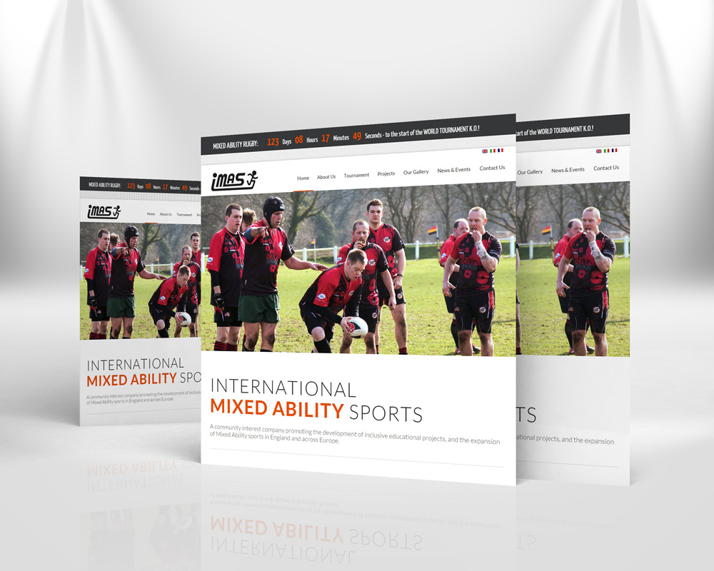
From initial website strategy to online marketing we ensure that we are creating the most effective website possible. We design and build responsive websites that work with any device.
Responsive websites allow a site to adapt to different screen sizes. Visitors to a responsive site using a mobile, tablet or desktop will see how the website changes to make the best possible use of the available screen size giving any visitor the best possible experience irrespective of the device they are using.


We build websites on content management system platforms allows you to control the content of your website – images, text, video, etc. without the need to for advanced technical training. We design to produce an online presence as a balance between creativity and functionality.
We design our eCommerce solutions to be simple enough for visitors to easily navigate, whilst also offering robust features that will make their experience enjoyable. Our solutions are customised to fit your specific business needs without sacrificing features and are directly integrated into our content management systems making managing your online store easy and efficient.
We will also work with you on-going as these needs may change over time, making it necessary for additional features and functionality.


If you require a more advanced website for your business operations then we would love to hear from you. We are experienced in designing and developing large sites with advanced functionality for a wide range of clients.
Our solutions include:


